Communal Data Collection Using Google Docs
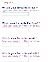
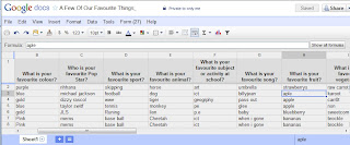
 The unit began in class using our Asus netbooks and a Google form I had prepared entitled " A Few of Our Favourite Things." The form was set up as an online questionaire, with free entry text boxes. The students accessed the web and followed a prepared link from the VLE to the data entry form. In pairs the students were encouraged to talk about and then respond individually to a collection of questions around the subject of our favourite things, such as what is your favourite colour/song/football team/subject at school? Completing the form and pressing submit, automatically updated a Google spreadsheet, that was displayed on screen. The live data collection was a real draw, as they watched each other's data arrive and the spreadsheet update in real time. Pace in this part of the session was generated by the sense of urgency to submit their information and see it appear before others. We knew how many students were in class, and so the size of the sample we expected to see. We could check quickly that everyone had submitted their data by counting the number of rows completed, before closing the "poll" and exporting the data sheets for use table top based activities. When all the data was in the spreadsheet was exported and saved as a pdf file, this was then printed and distributed to groups of students to use as the basis for tallying and data entry.
 As a primary teacher, I am familiar with the amount of time that can be taken up with student data collection, as individual students navigate the room, collecting responses by tally. I like the idea that using this method a range of data was collected relatively quickly, and as a communal act was then available to all following submission. One of our key questions before engaging with our data sets, must be has everyone responded. Placing the google spreadsheet centrally to the IWB, the students could see the sheet being updated as data came in, since the form had been set up so all fields were compulsory, no one could submit until they had completed each field, and then simply counting or tallying the number of respondants visible we could identify who we were waiting for. Having a range of data available allowed us to use real information in our initial skills teaching activities, and then for students themselves to select from data sets they were interested in to develop their own individual data sets for further exploration.
Rerepresenting our Samples as Frequency Tables
With the downloaded "spreadsheets" distributed to pairs of students, we worked together on our Netbooks as I modelled, using a projected image of the screen how to create a frequence table using Open Office's Calc spreadsheet. We did this using the same data set.... Our Favourite colours. The students were shown how to enter text labels in one column, elimnating duplicates as they went, before in the parallel column counting/tallying and recording the frequency of voters for each colour. These tables were then given a group constructed title, and the cells into which data had been entered were adjsuted for fit, and then formatted with borders. Each student pair then saved their file.
Next the students were asked to choose two data sets from those on the spreadsheet printout and to create frequency tables for these independently, saving their work periodically so the data would not be lost.
From Frequency Tables to Pictorial Representation
With our data enterd to the Spreadsheet and the tables formatted, we moved on together using the data set we had set up together as our starting point. Using the chart wizard students were guided through the creation of a bar chart. As we worked students discussed and were encouraged to add appropriate chart titles, and also axis labels. We identified which axis was the x and which the y, we discussed what was special about the data represented on these, and appropriate titles and labels for them. The students were also, shown how to change formatting and how to recolour the columns and bars in the chart.
Students were then left to practice this process creating a set of bar charts for each of the three other data sets they had created.
- Applying really clear and thorough titles for their charts that would help their readers.
- Producing Axis Labels that would inform their readers of exactly what was shown there
- Recolouring the data plots and bars, choosing appropriate colour fills and effects to match the data.
This process took approximately 3 sessions of an hour each. Once completed files and charts were upoaded to the VLE, from where they could be accessed for printing out and display.
Moving On: Presenting Pictograms in a Garden
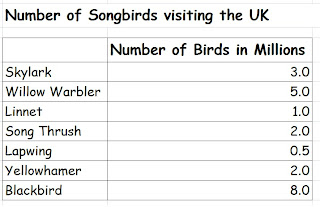
 In class the students had been introduced to Calc and Google Spreadsheets, and they had experienced using these tools as part of a collaborative task, to input and collect data remotely and to tally, enter, present and rerepresent data locally. In the final stage of this project however I wanted the students to get creative, considering other elements in chart creation with a spreadsheet environment, that might make our maths more appealing interesting and accessible to a reader. To do this I used another prepared data set, but this time based on a set of survey data I had available to me around songbird populations in the UK. For this series of activities the students were given access to Excel, rather than calc which they had been using on the netbook. We began the session by discussing Excel and comparing it to the other tools they had used. What did they notice about the environment? What was the same about it and what was different? For all intents and purposes the tools were largely the same, they were visually a grid, made up of cells arranged in rows and columns. We formatted the cells, rows and columns in a very similar way. With these identified, the students were then provided with data sets to enter, and format as before. We identified the chart wizard tool, and then set to work creating charts based on the data, adding appropriate axis labels and a clear title, with the students recolouring and reformatting the chart.
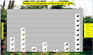
The students were then asked about the data itself. How many of these birds had they ever seen? Where would they expect to see them? Did the students think it would be possible to create a bar chart that would really draw in their audience, or even wow passers by as they were working? Could we create a chart that included images of the birds, and set the birds in their natural habitats. Viewing charts as part of the Multimodal world this would add an additional layer of meaning making to the outcomes.
The students were now engaged in a collect and store task, using an image search to locate individual images of each of the birds in question and one final image of a garden.... A bar chart in a garden...
The students were then encouraged to further explore the formatting tools for their charts, and to apply the skills tha already had from work with Calc. We made a second version and this time instead of colour formatting bars, used the fill effects button and picture tab to insert individual bird images to our chart columns. These were then scaled by 1, to create a pictogram type effect. Highlighting the chart area the garden image they had found was then applied as a background to the chart plot area itself. Very pretty. However with the images inserted the axis labels and values as well as the chart title were less readable, requiring some further formatting effects to be applied, changing font colours and backrounds became a necessity to make them readable.
 The outcomes are very attractive, as well as introducing for me a key aspect to the purpose of data handling the idea that we produce charts and graphs to be read and interpretted. Like other visual text sources, they are created to help an audience access and interpret them, the more relavant our content to context the more likely we are to portray the meaning we set out to share. Persuading students to use formatting devices for other reasons than because we can, is a key aspect to helping them understand the roll of such devices, and ICTs offer incredibly powerful and creative ways to do this. In this unit I wanted students to engage with Spreadsheets as a mathematical tool, not only for its pace and dynamic nature in presenting and representing information, but also as a way of managing the process and engaging with charts and graphs as a form of visual literacy.
No comments:
Post a Comment